Visualizing bootstrapped confidence intervals
The goal of this post is to show an approach for plotting a confidence interval on your ROC curves.
Step 1: Generate base set
First we’re going to generate some fake data to work with, and to do this I’m going to use the following function:
def get_sample_data(
    negative_label: int = 0, positive_label: int = 1, num_samples: int = 1000
) -> Tuple[ndarray, ndarray]:
    labels = np.random.randint(negative_label, positive_label + 1, num_samples)
    prediction_errors = np.random.normal(loc=0, scale=0.35, size=num_samples)
    scores = (labels + prediction_errors).clip(negative_label - 1, positive_label + 1)
    scores[scores > positive_label] = (positive_label + 1) - scores[scores > positive_label]
    scores[scores < negative_label] = negative_label - scores[scores < 0]
    return scores, labels
In the first line of the function, we generate an array of random labels using numpy’s random integer generator. All of these labels are either 0 (negative) or 1 (positive).
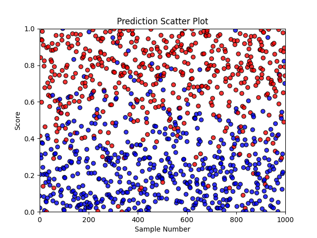
In the second line, we generate a random prediction error for each label. This prediction error represents a hypothetical classifier’s inability to always predict the correct label for a given sample.
The last few lines of the function use the labels and prediction errors to generate simulated classifier predictions while ensuring that these predictions are kept in the range of 0 to 1.
Next, we can use this function to get an idea of what our classifier predictions look like:
def plot_scatter(scores: ndarray, label: ndarray, positive_label: int) -> None:
    color = ["#ff0000" if v == positive_label else "#0000ff" for v in label]
    xs = np.arange(len(scores))
    plt.figure()
    plt.title("Prediction Scatter Plot")
    plt.xlabel("Sample Number")
    plt.ylabel("Score")
    plt.ylim([0, 1])
    plt.xlim([0, len(label)])
    plt.scatter(xs, scores, color=color, edgecolors="black", alpha=0.8)

Step 2: Generate bootstrapped sets
Out of the base set we created in step 1, we’ll now generate many sets through a sampling-with-replacement strategy as shown in the following image:

Depending on which samples are picked for a particular set, that set may be easier or harder than others. For example, in the previous figure, Bootstrap Set 2 has 3 hard (i.e. triangles), 2 moderately difficult (i.e. squares), and 1 easy (i.e. circle) samples. This is a more challenging set and will likely result in a lower AUC than Bootstrap Set n which has 3 easy and 3 moderately difficult samples.
The following couple of functions can be used to quickly generate many bootstrapped sets.
def check_valid_labels(labels: ndarray) -> bool:
    return len(np.unique(labels)) == 2

def get_fpr_tpr(scores: ndarray, labels: ndarray) -> Tuple[ndarray, ndarray]:
    fpr, tpr, thresholds = metrics.roc_curve(labels, scores, pos_label=1)
    return fpr, tpr

def gen_bootstraps(scores: ndarray, labels: ndarray, num_bootstraps: int = 1000) -> Iterator[Tuple[ndarray, ndarray]]:
    assert check_valid_labels(labels), "We cannot calculate AUC with fewer than 2 labels"
    for _ in range(num_bootstraps):
        random_indices = []
        while not check_valid_labels(labels[random_indices]):
            random_indices = np.random.randint(len(scores), size=len(scores))
        yield get_fpr_tpr(scores[random_indices], labels[random_indices])
In gen_bootstraps, we use check_valid_labels to make sure that each set has at least one sample with a positive label and one sample with a negative label. The assertion at the beginning of gen_bootstraps guarantees that we don’t end up in an infinite while loop later on in the function.
Step 3: Select confidence intervals
Using our bootstrapped sets, we can derive lower and upper bounds for our confidence interval. The first thing we want to do is standardize all bootstrapped true positive rates with a common false positive rate array as shown in the code snippet below:
def interpolate_tpr(fpr, tpr, fpr_new):
    return interpolate.interp1d(fpr, tpr, kind="linear")(fpr_new)

def get_interpolated_bootstraps(scores: ndarray, labels: ndarray) -> Tuple[ndarray, List[ndarray]]:
    fpr_common = np.linspace(1, 0, num=1000, endpoint=True)
    interpolated_tpr_list = [interpolate_tpr(fpr, tpr, fpr_common) for fpr, tpr in gen_bootstraps(scores, labels)]
    return fpr_common, interpolated_tpr_list
Now we can select true positive rates which correspond to specific percentiles (e.g. 95th percentile):
def get_percentiles(tpr_bootstraps: List[ndarray], percentiles: List[float]) -> ndarray:
    """Return an array of TPRs where each row reflects the xth percentile TPR value at each common FPR value"""
    sorted_tpr = np.sort(np.array(tpr_bootstraps), axis=0)
    max_index = len(tpr_bootstraps) - 1
    indices = [int(round(p * max_index)) for p in percentiles]
    return sorted_tpr[indices]
In the first line of get_percentiles we turn our list of true positive rates into a 2-dimensional array where each column corresponds to all possible true positive rates for a specific false positive rate and each row corresponds to a different bootstrap set. In this first line we also sort all values in each column from lowest to highest. Once the column values have been sorted by magnitude, each row no longer corresponds to a bootstrap set but to a percentile. Selecting the 0th row of sorted_tpr means selecting the 0th percentile.
Both get_interpolated_bootstraps and get_percentiles can be used together as shown in the following function:
def get_roc_ci(scores: ndarray, labels: ndarray, interval: float) -> Tuple[ndarray, ndarray, ndarray]:
    fpr, tpr_bootstraps = get_interpolated_bootstraps(scores, labels)
    ci_lower_limit = (1 - interval) / 2
    ci_upper_limit = interval + ci_lower_limit
    tpr_lb, tpr_ub = get_percentiles(tpr_bootstraps, [ci_lower_limit, ci_upper_limit])
    return fpr, tpr_lb, tpr_ub
Step 4: Visualize confidence intervals
Finally, we can pull everything together to produce a nice looking ROC curve. Here is some code which leverages our previously defined functions:
def plot_roc_ci(scores: ndarray, labels: ndarray, color: str, interval: float = 0.95) -> None:
    fpr, tpr_lb, tpr_ub = get_roc_ci(scores, labels, interval)
    label = f"{int(round(interval * 100))}% CI: {metrics.auc(fpr, tpr_lb):0.4}-{metrics.auc(fpr, tpr_ub):0.4}"
    plt.plot(fpr, tpr_lb, color=color, linestyle="--")
    plt.plot(fpr, tpr_ub, color=color, linestyle="--", label=label)
    plt.fill_between(fpr, tpr_lb, tpr_ub, color=color, alpha=0.1)

def plot_roc(scores: ndarray, labels: ndarray, color: str) -> None:
    fpr, tpr = get_fpr_tpr(scores, labels)
    auc = metrics.auc(fpr, tpr)
    plt.plot(fpr, tpr, color=color, label=f"AUC: {auc:0.4}")

def plot_roc_with_ci(scores: ndarray, label: ndarray, color: str = "#00aa00") -> None:
    plt.figure()
    plt.grid(True, linestyle="--")
    # Reference line (a straight line represents a useless classifier)
    plt.title("Receiver Operating Characteristic")
    plt.xlabel("FPR")
    plt.ylabel("TPR")
    plt.plot([0, 1], [0, 1], "--", color="gray", linewidth=0.5)
    plt.xlim([0, 1])
    plt.ylim([0, 1])
    plot_roc(scores, label, color)
    plot_roc_ci(scores, label, color)
    plt.legend()
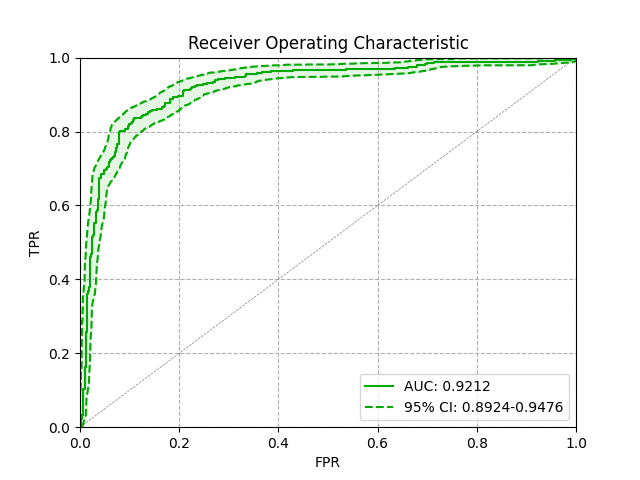
Which gives us:

I hope you enjoyed this post. If you found it helpful or spotted any mistakes, please feel free to reach out.